
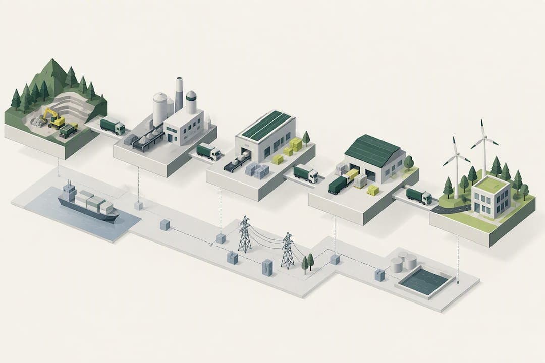
Value chain mapping is a visual, data-backed representation of the actors and flows that create your product or service. It reveals where value, cost and emissions concentrate so you can prioritize improvement. The approach builds on the framework Michael Porter introduced and connects directly to modern carbon accounting rules from the GHG Protocol, giving managers a single method for both operational and sustainability decisions.
TL;DR:
- Most value chain mapping projects should start with a clear scope focused on specific decisions like cost reduction or emissions prioritization.
- Effective maps include all direct, indirect, and support actors, along with product, information, and finance flows, volumes, and prices at each stage.
- Validation with actual actors and triangulation of data sources are essential to ensure accuracy and prevent misdirected efforts.
- Using a two-layer approach—simple for decision-makers and detailed with data for implementation—enhances clarity and usability.
- Mapping is most valuable when Scope 3 emissions are material, recurring cost issues exist, or strategic differentiation depends on understanding supply chain impacts.
Table of Contents
- What value chain mapping is and why it matters
- Core components of an effective value chain map
- How to map a value chain step by step
- Tools, templates and analysis techniques
- Mapping's role in Scope 3 and ESG reporting
- Common pitfalls and how to avoid them
- A worked example: tracing energy use through a supply chain
- When mapping is worth the investment
- Sources
- FAQ
What value chain mapping is and why it matters
Michael Porter's original model splits a company's activities into two groups. Primary activities carry the product from raw input to customer: inbound logistics, operations, outbound logistics, marketing and sales, and service. Support activities make those primary functions possible: firm infrastructure, human resources, technology development and procurement. Harvard Business School's guidance on value chain analysis frames the exercise as identifying each activity, assigning it a value and a cost, then looking for gaps between the two where a competitive opportunity sits.
Mapping extends this idea from a conceptual list into a working diagram. Instead of naming categories in the abstract, you trace the actual suppliers, processors, distributors and partners involved, along with the product, information and money that move between them. That extra layer of detail turns Porter's model from a strategy lecture into an operating document.
Companies run mapping projects for several overlapping reasons. Cost reduction is the most common: a map exposes redundant handling steps, long transport legs or margin stacking that a spreadsheet alone would hide. Differentiation is another: seeing the full chain often reveals a step, like a certification or a proprietary process, that competitors cannot easily copy. Risk management benefits too, since a map shows single points of failure such as one supplier serving multiple critical inputs. Increasingly, sustainability teams use the same map to trace where energy use and emissions concentrate, since the physical chain and the carbon footprint follow the same actors and flows.
A completed mapping project typically delivers:
- A visual diagram of every actor from raw material to end customer, with flows labeled by direction and type.
- A quantified view of where cost, margin and time accumulate across the chain.
- A shortlist of intervention points ranked by potential impact.
- A baseline dataset that sustainability and finance teams can both reuse.
The output is not just a picture. It is a decision tool that operations, procurement and sustainability teams can each pull from without duplicating the underlying research.
Core components of an effective value chain map
A map that skips a category will misdirect the analysis that follows it, so it helps to work from a checklist rather than freehand. The ACIAR toolbook on mapping value chains treats this structure as the minimum standard for a usable map, not an optional extra.
A complete map includes:
- Direct actors: producers, processors, distributors, retailers and end buyers who take ownership of the product at some point.
- Indirect and support actors: input suppliers, transporters, certifiers, financiers and technical advisors who enable the chain without owning the product.
- Product flows: the physical form of the product at each stage, since a raw material, a semi-processed good and a finished item are rarely the same shape or volume.
- Information flows: orders, forecasts and specifications moving in both directions between actors.
- Finance flows: payments, credit terms and margins at each transaction point.
- Volumes and prices: the quantities moving through each channel and what each actor pays or charges, which is what turns a diagram into an analysis.
Real chains are rarely a single straight line. Most products move through parallel channels at once, such as a wholesale route and a direct-to-retail route running side by side, and a map that forces everything into one path will misrepresent the business. Informal actors, including small intermediaries or unregistered processors, are easy to leave out but often handle a significant share of volume, so the ACIAR toolbook recommends actively searching for them rather than assuming the formal chain is the whole picture.
On notation, keep a first pass simple: boxes for actors, arrows for flows, and a separate arrow style or color for product versus information versus money. Layer in detail only once the skeleton is validated. A map that tries to show every metric at first draft becomes unreadable, while a map built in layers lets you present a clean overview to executives and a detailed version to the team doing the work.
Pro Tip: Build the map in two layers from the start: one clean version for decision makers and one detailed version with every data point attached, so you never have to strip a working document down for a presentation.
How to map a value chain step by step
A mapping project moves through five stages, each with its own deliverable, so a team can plan the work rather than treat it as an open-ended research task.
- Set the objective and scope. Decide what decision the map needs to support, such as cutting cost in a specific product line or identifying which suppliers drive the largest share of Scope 3 emissions. HBS's value chain analysis framework works best when it is tied to a measurable outcome rather than run as a general audit, since an unscoped map tends to sprawl without producing a usable answer.
- Identify actors and flows. List every actor upstream and downstream of your own operation, then decide how granular to go. A single supplier tier might be enough for a first pass, while a chain with known risk concentrated further upstream may need a second or third tier mapped in detail.
- Collect evidence. Pull data from internal systems first (purchasing records, logistics software, billing platforms), then fill gaps with supplier questionnaires, interviews and sector-level secondary data where direct data is not available. The ACIAR toolbook recommends combining qualitative interviews with quantitative cost and margin data rather than relying on one source type alone, since a single data source tends to miss informal actors and off-book transactions.
- Draft the map. Use a consistent notation across the whole diagram: actors as boxes, flows as labeled arrows, and a separate layer for the metrics you plan to attach, whether that is volume, cost, margin or energy use. Attach numbers only where you have a source for them, and mark estimates clearly so nobody mistakes a placeholder figure for confirmed data.
- Validate and prioritize. Share the draft with the actors closest to each stage, since a mapping exercise built only from internal assumptions will contain errors that suppliers or distributors can catch immediately. Once validated, rank the intervention points you have identified by impact against effort, and focus the next phase of work on the highest-impact, lowest-effort items first.
A realistic mapping project takes shape differently depending on scale. A single product line with a handful of known suppliers can be mapped by one or two people in two to four weeks. A multi-site organization with several product families and multiple supplier tiers typically needs a small cross-functional team, procurement, operations and sustainability represented, over a quarter. A group-wide mapping exercise covering an entire portfolio, especially one that feeds into emissions accounting, often runs closer to two quarters and needs sponsorship from both operations and finance to get supplier data released on time.
The scope decision matters more than the tool you use to draw it. Teams that tie the map to a specific outcome, such as a targeted reduction in a cost category, consistently produce a document that gets used in the following quarter's planning, according to HBS's guidance on value chain analysis. Teams that map for the sake of mapping tend to produce a diagram that sits unused once the project ends.

Tools, templates and analysis techniques
The right tool depends on what decision the map needs to support, not on which software happens to be available. A simple diagram template, boxes and arrows in a drawing tool or slide deck, is often sufficient for a first pass that establishes the actors and flows before any numbers are attached. Once you need to compare cost, margin or volume across stages, a table or spreadsheet becomes more useful than a diagram, since it lets you sort and filter actors by whichever metric matters for the decision at hand. Only when the chain is large or the questions are complex, such as modeling how a cost shock at one supplier ripples through multiple tiers, does a more advanced quantitative model earn its extra setup time.
Two broad technique families cover most mapping projects:
- Qualitative techniques examine governance (who sets terms and standards), linkages (how tightly actors are connected) and power (who can dictate price or volume to whom).
- Quantitative techniques cover cost and margin analysis at each stage, along with spend-based estimates for emissions when direct supplier data is not available.
The ACIAR toolbook treats these as complementary rather than alternative choices: a governance analysis explains why a cost gap exists, while a cost and margin analysis quantifies it.
Sourcing supplier data is usually the hardest part of the process. Direct requests work for large, well-organized suppliers but often stall with smaller or informal actors who do not track the information in a form you can use. When primary data is missing, sector averages and secondary data sources can fill the gap for a first-pass estimate, as long as the map clearly flags which figures are estimated and which are confirmed. Treating an estimate as final data is the single most common way a mapping project loses credibility with the stakeholders reviewing it later.
Mapping's role in Scope 3 and ESG reporting
Corporate emissions accounting splits into three scopes: Scope 1 covers direct emissions from owned operations, Scope 2 covers purchased energy, and Scope 3 covers everything else in the value chain, from purchased goods to employee travel to the use and disposal of sold products. The GHG Protocol's Corporate Value Chain (Scope 3) Standard sets out 15 categories within that third scope and notes that Scope 3 often makes up the majority of a company's total footprint, which is exactly why a value chain map matters for emissions work: you cannot target reductions in a category you have not identified.
A completed value chain map gives a sustainability team three practical tools for Scope 3 work:
- A list of actors to prioritize for direct emissions data requests, starting with the highest-volume suppliers.
- A structure for applying spend-based or average-intensity emissions factors to the actors who cannot provide primary data.
- A way to link specific supplier relationships to specific Scope 3 categories, rather than treating Scope 3 as one undifferentiated total.
When supplier-specific data is not available, three estimation approaches fill the gap in order of preference: activity-data approaches (using actual quantities of materials or energy where known), average-intensity approaches (applying a typical emissions factor for that industry or material), and spend-based approaches (estimating emissions from the amount spent with a supplier when no other data exists). Each approach trades accuracy for ease of use, and most mapping projects end up using all three at different points in the same chain depending on which suppliers can and cannot provide primary data.
GHG Protocol guidance treats Scope 3 as typically the largest share of a company's total footprint, which is why a map built for cost analysis is usually worth extending into an emissions tool rather than running two separate exercises. Once the map identifies which suppliers or activities carry the largest volume, that same ranking tends to point toward the categories where emissions reduction will have the biggest effect, whether that means switching a material, consolidating shipments or engaging a supplier directly on their own energy use.
Common pitfalls and how to avoid them
Most failed mapping projects share the same handful of mistakes. An unclear scope is the most frequent: without a defined outcome, teams end up mapping everything in equal detail and never finish. Omitting informal actors is another, since unregistered intermediaries or small subcontractors are easy to miss but can carry a meaningful share of volume or risk. Relying on a single data source, usually internal purchasing records, misses the off-book transactions and informal terms that a supplier interview would surface. Skipping validation with the actors on the map is the mistake that causes the most damage after the fact, since an unverified map can send a team toward a supplier issue that does not actually exist.
The fixes are straightforward:
- Scope every project by outcome before drawing a single box.
- Run the first pass as a pilot on one product line, then expand once the method is proven.
- Schedule a validation session with key suppliers or partners before treating any figure as final.
- Link every intervention identified in the map back to a KPI someone is already tracking.
Pro Tip: Triangulate every important figure across at least two sources, internal records plus a supplier confirmation, before it goes into a final map.
Pro Tip: Present the finished map as a set of decisions to make, not a diagram to admire, or it will sit unused after the meeting that approved it.
A worked example: tracing energy use through a supply chain
Take a fictional example: a mid-sized manufacturer mapping the chain behind one product line, from a raw material supplier through a contract processor to its own assembly site and out to a distributor. Attaching one metric, energy spend, to each actor turns the diagram into an analysis rather than a picture.
| Actor | Role in chain | Energy metric attached |
|---|---|---|
| Raw material supplier | Extracts and preprocesses input | Estimated from spend, no primary data available |
| Contract processor | Converts input into intermediate good | Monthly energy invoice shared by supplier |
| Assembly site (own operation) | Final assembly and packaging | Half-hourly consumption data from internal metering |
| Distributor | Warehousing and transport to retail | Estimated from fuel spend |
The assembly site's own energy figures are the easiest to pin down precisely because they come from metered, half-hourly data rather than an estimate, and this is where platforms like EnerlyticsAI's emissions reporting plug directly into a map: half-hourly consumption analytics and anomaly detection on billing data give the operations-side actor in the chain a confirmed figure rather than a spend-based guess. Extending that same confirmed-data discipline to upstream actors, through supplier questionnaires or shared metering, is what moves a map from mostly-estimated to mostly-verified over successive mapping cycles.
When mapping is worth the investment
Mapping earns its cost fastest when Scope 3 emissions are material to your footprint, when you are repositioning strategically and need to know where real differentiation sits, or when a cost problem keeps recurring without a clear source. In those situations, a map turns a vague concern into a ranked list of actors and actions.
Expect the first pilot to take a few weeks on a single product line, with an early win being a shortlist of two or three high-impact intervention points rather than a finished company-wide diagram. That shortlist is the actual return on the project, not the diagram itself.
My recommendation is to start narrow. Pilot one chain, validate it with the actors involved, then decide whether the method earns a bigger scope. A free-tier tool for gathering the energy and billing data that feeds the map costs nothing to try before committing a team to a larger rollout.
— Chris
Sources
- What Is a Value Chain Analysis? 3 Steps
- Making value chains work: Toolbook (Tool 2: Mapping the Value Chain)
FAQ
What are the five elements of the value chain?
Porter's model groups activities into five primary categories: inbound logistics, operations, outbound logistics, marketing and sales, and service, according to HBS's value chain analysis guide. Four support activities, infrastructure, human resources, technology development and procurement, run alongside them and enable each primary activity to function.
What is Michael Porter's value chain model?
Porter's model treats a company as a series of discrete activities that each add cost and value, and it splits those activities into primary functions that touch the product directly and support functions that enable them. The model is used to find where a business can reduce cost or create a difference competitors cannot easily copy.
How do you perform a value chain analysis?
HBS's methodology breaks the process into three steps: identify every primary and support activity, assign a value and a cost to each one, then look for gaps between value and cost that point to a competitive opportunity. A full mapping exercise extends this by tracing the actual actors and flows behind each activity rather than analyzing the categories in the abstract.
What is a value chain diagram?
A value chain diagram is a visual map showing the actors, activities and flows, product, information and finance, involved in creating and delivering a product or service. It typically layers in metrics like volume, price or emissions once the basic actor and flow structure is confirmed, turning a static picture into a working analysis tool.